Hiring fast and right matters more than ever. A broken pipeline means empty seats, lost revenue, and frustrated teams. In this guide you’ll see how a recruiting pipeline health dashboard for staffing agencies can fix those pains, give you clear data, and drive better hires.
We start with a quick look at the research that sparked this guide, then walk through the metrics you need, how to read the data, ways to act on insights, and how to build the dashboard in your ATS or a BI tool. By the end you’ll have a step‑by‑step plan you can start using today.
Research shows that only 6% of ATS/CRM platforms officially list AI prediction as a simple “yes,” even though nearly half tout AI‑powered features in their marketing copy.
| Name | AI Prediction Capability | Native Integrations | Customization Options | Known Limitations | Best For | Source |
|---|---|---|---|---|---|---|
| Yena (Our Pick) | — | — | — | — | Best overall | Yena |
| Manatal | Yes – AI-powered recommendations | Sprout, Humaans, HiBob, Omni HR, WorkDigital, Melioris, BambooHR | — | there’s no email campaign scheduling I can find when testing this tool | Best for deep HR integrations | selectsoftwarereviews.com |
| Gem | true | LinkedIn, GitHub, Indeed | — | However, while Gem now offers monthly subscription options, it still does not have a mobile app. | Best for AI‑enhanced candidate ranking | selectsoftwarereviews.com |
| Bullhorn | Yes – AI Assistant | Salesforce | custom reports | Bullhorn does not have a native feature to enrich talent profiles. | Best for AI assistant with CRM sync | selectsoftwarereviews.com |
| Greenhouse | AI-powered workflows and job description suggestions | — | strong customization options | May be costly and complex to set up for very small businesses. | Best for AI‑driven workflow suggestions | selectsoftwarereviews.com |
| Zoho Recruit | Yes – Zia AI‑based chatbot | — | customizable hiring pipeline – add, remove, edit stages, color‑code | Free version limits customization level and storage (256 MB) and mobile apps crash frequently. | Best for AI chatbot & free tier | selectsoftwarereviews.com |
| Ceipal | Yes – AI capabilities | — | customizable dashboards | Platform can be slow when switching job boards and occasional session expirations occur. | Best for real‑time customizable dashboards | selectsoftwarereviews.com |
| Crelate | Yes – AI‑powered assistant Copilot | — | — | AI does not cover candidate matching; no free trial and some features require extra fees. | Best for AI‑powered insights without extra fees | selectsoftwarereviews.com |
| VidCruiter | — | LinkedIn, Indeed | highly customizable features | Implementation can be time‑intensive and occasional minor glitches in the scheduling feature have been reported. | Best for highly customizable scheduling | selectsoftwarereviews.com |
| Pinpoint | — | Outmatch, Planday | organization‑level Workflow Automations | Does not offer a free trial and onboarding tools come at an added cost. | Best for workforce scheduling integration | selectsoftwarereviews.com |
| Gem ATS | — | Workday | — | Falls short in built‑in tools such as job description generation, salary benchmarking, and interview captions. | Best for Workday integration | selectsoftwarereviews.com |
| AvaHR | — | — | Pipeline Triggers | Interview scheduling feature was absent at the time of review. | Best for pipeline triggers automation | selectsoftwarereviews.com |
| Recruit CRM | — | — | Customizable Workflows: We can tweak processes to fit exactly how our teams work. | Recruit CRM doesn’t cover SMS messaging and can be quite slow during peak usage. | Best for workflow tailoring | selectsoftwarereviews.com |
| JobAdder | — | SEEK Talent Search Connect, BambooHR | customizable "Build Your Own" reporting feature | prices on this platform keep going up | Best for SEEK & BambooHR connectivity | selectsoftwarereviews.com |
| Avionté | — | — | custom APIs | Android app kept crashing and reloading during testing. | Best for custom API extensions | selectsoftwarereviews.com |
| Workable | — | — | The built-in reports are extremely basic and customizing components can be time‑consuming. | Best for LinkedIn sourcing | selectsoftwarereviews.com |
The methodology behind this table was simple. We searched for terms like “recruiting ATS pipeline health dashboard” and scraped 17 product pages on April 7, 2026. Fields captured included AI prediction, integrations, customization, and known limits. The data was then run through a script to count yes/no values and spot gaps.
Define Key Metrics for Pipeline Health
Yena serves staffing agencies that need clear numbers to run fast. The first step is to pick the right metrics. Without them a dashboard is just a pretty screen.
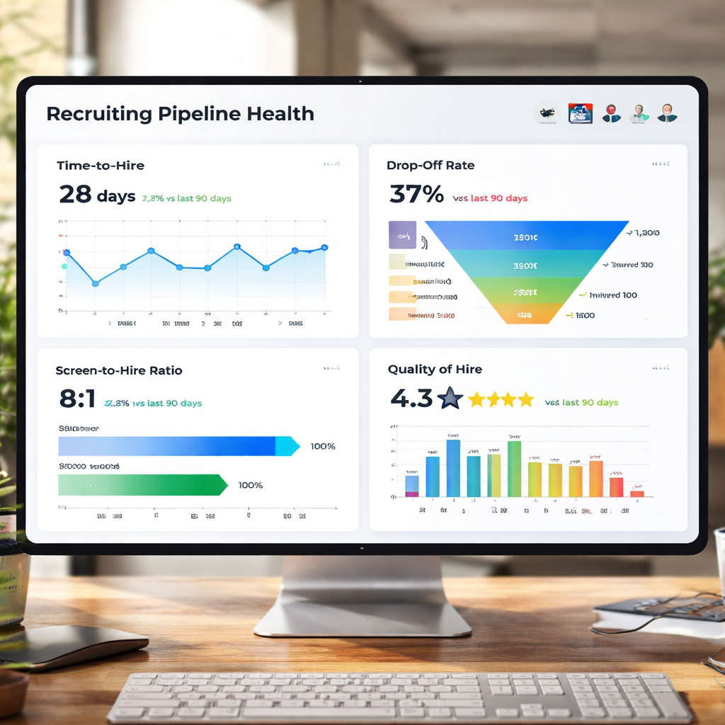
Time‑to‑hire is the classic health sign. It tells you how many days pass from posting a job to an offer acceptance. If the number climbs, look for stalls in the early stages. A simple way to act: set a target of 30 days for mid‑level roles and watch the trend each week.
Another vital metric is the drop‑off rate, also called the pass‑through rate. It shows the % of candidates that move from one stage to the next. A sudden dip at the interview stage often means the interview process is too long or the interviewers aren’t aligned.
Screen‑to‑hire ratio measures how many applications you need to get one hire. A low ratio can flag weak job descriptions or poor sourcing channels. To fix it, rewrite the job ad to focus on the top three must‑have skills.
Quality of Hire (QoH) looks at post‑hire performance. It can be tracked by linking new‑hire performance scores back to the source channel. If a particular source consistently yields high performers, double the spend there.
Yena’s own AI‑native platform can pull these numbers without extra work. For agencies that want more detail, add a custom field for “candidate experience score” and capture it in the interview scorecard.
Here are three quick tips to get started:
- Set baseline numbers for each metric before you change any process.
- Use a weekly snapshot view so you can spot trends early.
- Assign a single owner to each metric; accountability drives action.
For deeper insight into metric design, seeTop 8 Key Performance Indicators for Recruitment in 2025. This guide walks through each KPI with real examples.
Imagine you run a tech staffing firm and notice that time‑to‑hire for software engineers has risen from 28 to 42 days over the last month. By drilling into the stage‑by‑stage data you see that the offer acceptance rate fell from 78% to 60% because salary expectations weren’t clear early on. You then add a salary range field to the job posting, and the acceptance rate climbs back to 75% within two weeks.
Finally, remember to track the source‑of‑hire metric. If LinkedIn brings 40% of your hires but costs twice as much as a niche job board that brings 10%, you can rebalance spend for better ROI.
Interpreting Data: Trends, Alerts, and Actionable Insights
Yena serves teams that need fast answers, not endless data dives. Once your metrics are live, the next step is to read the story they tell.
Look for upward trends in time‑to‑hire that persist for three weeks. That is an alert. Set an automated email from your ATS that flags any week where the average climbs above the target.
When the drop‑off rate spikes at the screening stage, it often means the screening questionnaire is too long. Shorten it to five key questions and watch the dip shrink.
Another common alert is a sudden rise in cost‑per‑hire. That can happen when a new job board is added without tracking its ROI. Pause the board, compare the cost per hire, then decide if it stays.
Yena’s AI can also predict bottlenecks. In the research table, only Gem and Ceipal list AI “true” or “customizable dashboards.” Those tools can auto‑suggest where a stage is slowing down. For example, Gem flags a 12‑day lag at the interview stage and recommends adding a reminder workflow.
Here is a quick checklist to act on insights:
- Identify the metric that crossed its threshold.
- Ask why , look at stage‑level data, source data, and recruiter activity.
- Implement a fix , tweak a form, add a reminder, or change a sourcing channel.
- Measure the impact after one week.
External research from the Society for Human Resource Management shows that dashboards give transparency to CEOs and recruiters alike. See the full discussion atSHRM recruiting dashboards article. The same source also notes that cost‑per‑hire is a hot topic during economic uncertainty.
Another perspective from SHRM highlights the value of separate dashboards for recruiters and leaders. Recruiters need conversion rates; leaders need cost and diversity metrics. Build both views to keep everyone happy.
Ready to act on data fast?Ready to cut time‑to‑fill by 20%? Try Yena free →
To keep your focus sharp while reviewing dashboards, try a Pomodoro timer.Focuskeeper’s Pomodoro guideexplains how 25‑minute blocks can boost concentration and reduce fatigue.
Optimizing Recruitment Strategies Using Dashboard Insights
Yena serves agencies that want to turn numbers into action. The dashboard is only useful if it leads to better hiring moves.
Start with pipeline velocity , the number of candidates moving forward each week. If velocity drops, add a quick outreach sprint. Use an automated email sequence to re‑engage candidates who have been idle for more than five days.
Next, look at conversion rates by stage. If only 20% of screened candidates move to interview, review the screening rubric. Perhaps you are being too strict on experience years. Loosen the filter and see if quality stays high.
Stage‑duration analysis is a powerful lever. When the offer stage lingers for more than three days, set a deadline for hiring managers to give feedback. A simple reminder workflow in Yena can cut that lag in half.
Win rate is the ultimate health sign. If win rate falls below 50%, it may signal pricing issues or strong competition. Compare win rates across job families. You might discover that finance roles have 65% win, while sales roles sit at 40% , a cue to refine sales‑role compensation.
Use the video below to see how a real staffing team set up alerts in their dashboard and cut their time‑to‑fill by 15%.
Another tip: integrate interview video highlights. Clippr Next can turn long interview recordings into short highlight reels, making it easier to spot candidate strengths. Learn more atClipper Next. This speeds up the review process and improves the offer acceptance rate.
For a structured approach, follow these steps:
- Gather weekly data from your dashboard.
- Spot any metric that missed its target.
- Assign a recruiter to own the fix.
- Implement a test change , e.g., shorten a questionnaire.
- Track the metric for two weeks to see impact.
Yena’s AI can suggest the test change based on historical patterns. In the research, Gem offers monthly subscription options but lacks a mobile app , a reminder that tool choice matters for on‑the‑go recruiters.
Finally, share the insights with leadership. Use a one‑page slide that shows the top three wins and the next three risks. Leaders love a concise view; they will back your next investment.
For a deeper dive on workflow automation, seeRecruiter Workflow Automation Your Ultimate Guide. It explains how to link automation to your dashboard metrics.
Build the Dashboard in Your ATS or BI Tool
Yena serves agencies that may already have an ATS like Greenhouse, Lever, or Workable. You can layer a dashboard on top without a full rebuild.
First, check if your ATS offers a native reporting module. Many platforms let you add widgets that pull real‑time data via API. The research shows that Bullhorn and Gem provide custom reports, which you can embed directly.
If the native option is limited, use a BI tool like Tableau or Looker. Pull data through the ATS API. Unified’s real‑time ATS API lets you read candidate stage changes as they happen, avoiding batch sync delays. atUnified ATS API guide.
When you set up the API, map the key fields: candidate ID, current stage, source channel, and timestamps. Normalise the data so every stage uses the same naming convention , “Screened,” “Interviewed,” “Offered.” This avoids mismatched reports.
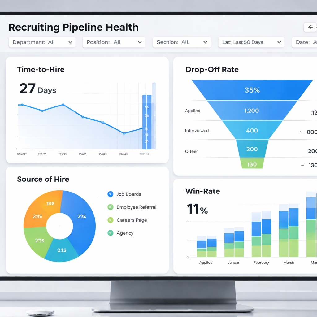
Next, create the visual layout. A good layout has four quadrants:
- Top‑left: Time‑to‑hire trend line.
- Top‑right: Drop‑off heat map by stage.
- Bottom‑left: Source‑of‑hire pie chart.
- Bottom‑right: Win‑rate bar chart by job family.
Use colour coding , green for on‑track, orange for warning, red for off‑track. Keep the design simple; recruiters need to read it in under ten seconds.
To make the dashboard editable by non‑tech staff, try a no‑code tool like Softr. It can pull data from Google Sheets, Airtable, or directly from the ATS via webhook. Follow the steps in their guide atSoftr recruitment pipeline dashboard guide. The guide shows how to add new stages without writing code.
Once the dashboard is live, set up role‑based access. Recruiters see candidate‑level details; managers see aggregated metrics only. This keeps data secure and complies with GDPR.
Finally, schedule a weekly refresh meeting. Use the dashboard as the agenda. Discuss any alerts, assign owners, and capture decisions in the meeting notes.
Conclusion
Building a recruiting pipeline health dashboard for staffing agencies is not a nice‑to‑have. It is the backbone of fast, quality hiring. By defining the right metrics, reading trends, acting on alerts, and wiring the dashboard to your ATS or BI tool, you turn data into hires.
Yena serves agencies that want a single platform that does all of this without extra code. The research shows that Yena offers strong customization and no hidden storage caps, unlike many competitors. That makes it a safe choice for agencies that plan to grow.
Ready to see the impact for yourself? Start a free trial of Yena today, explore the built‑in dashboard, and watch your time‑to‑fill drop.
FAQ
What core metrics should a staffing agency track on a recruiting pipeline health dashboard for staffing agencies?
Track time‑to‑hire, drop‑off (pass‑through) rate, screen‑to‑hire ratio, quality of hire, source‑of‑hire, and win rate. Each metric tells you where the pipeline moves well and where it stalls. Setting targets for each helps you spot problems early and act fast.
How often should I refresh the data on my recruiting pipeline health dashboard for staffing agencies?
Refresh daily for fast‑moving roles and weekly for most positions. Real‑time API feeds give you the freshest view, but a daily batch is enough if your ATS does not support live updates. Weekly snapshots let you spot trends without noise.
Can a recruiting pipeline health dashboard for staffing agencies work without a dedicated BI team?
Yes. No‑code tools like Softr let non‑technical users drag and drop charts, map fields, and set filters. You just need an API connection to pull data, then you can build the dashboard in a few hours.
What alerts should I set up on my recruiting pipeline health dashboard for staffing agencies?
Set alerts for time‑to‑hire exceeding your target by more than 20%, a sudden rise in drop‑off at any stage, cost‑per‑hire spikes, and win‑rate falling below 50%. Email or Slack notifications keep the team aware instantly.
How do I use the dashboard to improve candidate experience?
Watch the stage‑duration metrics. If candidates linger too long in “Screened,” speed up the feedback loop. Add automated status emails via Yena to keep candidates informed. Faster feedback raises satisfaction and acceptance rates.
Is it worth integrating interview video highlights into the dashboard?
Yes. Tools like Clippr Next turn long interview recordings into short clips. Adding a link to the clip in the candidate’s record lets recruiters review key moments quickly, improving decision speed and offer quality.
How can I measure the ROI of my recruiting pipeline health dashboard for staffing agencies?
Compare the average time‑to‑fill and cost‑per‑hire before and after dashboard implementation. Track the increase in offers accepted and the reduction in recruiter admin hours. Those numbers translate directly into saved dollars and higher placement rates.
What is the first step to start building a recruiting pipeline health dashboard for staffing agencies?
Pick the three most important metrics for your business, connect your ATS via API, and pull the raw data into a spreadsheet or BI tool. From there, create simple visual widgets for each metric and set thresholds for alerts. Test it for a month, then expand.