Font Size Resume: Find the Perfect Size for Your CV
- Janis Kolomenskis
- Jul 10
- 10 min read
Let's get one thing straight: your font size is a much bigger deal than you think. When it comes to the main body of your CV, the magic number is between 10 and 12 points. Sticking to this simple rule is one of the easiest ways to make sure a human recruiter can actually read your CV and that it plays nicely with automated screening software.
Why Your CV Font Size Is A Deal-Breaker
Picture this: your CV is your one shot, your seven-second sales pitch to a busy recruiter. That’s genuinely how little time they often spend on a first glance before making a snap judgment. In that lightning-fast review, your font size isn't just some minor formatting choice—it's the very thing that delivers your message.
Getting the font size right makes your skills and achievements jump off the page. It signals professionalism and shows you respect the recruiter's packed schedule. But get it wrong, and you could torpedo your chances before they even read about your brilliant experience.
The Psychology of Readability
It’s all about finding that perfect balance. If your font is too small, you're literally forcing the recruiter to squint and strain. That creates instant friction, and in a sea of applications, it’s a quick trip to the 'no' pile.
On the flip side, going too big can come across as unprofessional or even a bit childish. It also wolfs down valuable space on the page, meaning you either have to cut important details or awkwardly spill over onto a second page. The sweet spot is where your CV looks clean, professional, and is effortless to read.
First impressions are everything in the hiring game. The font size you choose directly affects how scannable your CV is, which in turn decides whether a recruiter gives it a closer look or just moves on.
This is especially true when you consider the sheer volume of applications recruiters handle. Labour market conditions in places like Latvia mean recruiters are sifting through endless CVs every single day, often spending just six seconds on each one. A clear, legible font isn't just a nice-to-have; it's absolutely essential to making a good impression.
Ultimately, a smart font size on your CV ensures all the hard work you put into writing it gets the attention it deserves. It’s a subtle nod that you're a thoughtful professional who gets it. For more great tips on putting together a winning document, check out our guide on the [6 best jobseeker CV template resources for 2025](https://www.yena.ai/post/6-best-jobseeker-cv-template-resources-for-2025).
The Goldilocks Rule for Resume Font Size
Ever heard of the "Goldilocks Rule"? When it comes to your resume's font size, it's the perfect principle to follow. You don't want it so big that it looks clunky and unprofessional, but you definitely don't want it so small that the recruiter has to squint. Your goal is to find that sweet spot that's just right.
Think about it from the hiring manager's perspective. They're sifting through dozens, maybe hundreds, of resumes. You want to make their job as easy as possible. The right font size makes your resume effortless to scan, allowing your skills and achievements to shine through without any friction.
So, what's the magic number? For the core content of your resume—the bullet points detailing your incredible experience and accomplishments—the proven range is between 10 and 12 points. This is the professional standard for a reason. It’s legible, clean, and helps you fit everything you need onto that coveted single page without it looking cluttered.
Finding Your Perfect Fit
Of course, your entire resume can't be one size. That would be a visual nightmare! To create a document that's easy to navigate, you need to establish a clear visual hierarchy. This just means using different sizes to guide the reader's eye to the most important parts first, starting with your name and flowing down through your experience.
Here’s a simple, effective strategy that works every time:
Your Name: This should be the star of the show. Go for 18-24pt to make sure it stands out immediately.
Section Headings: For titles like "Work Experience" or "Education," use 12-16pt. This breaks the document into clean, digestible sections.
Body Text & Contact Info: Stick to the highly readable 10-12pt for all the crucial details.
This handy visual breaks down what font sizes recruiters and hiring managers actually prefer to see.
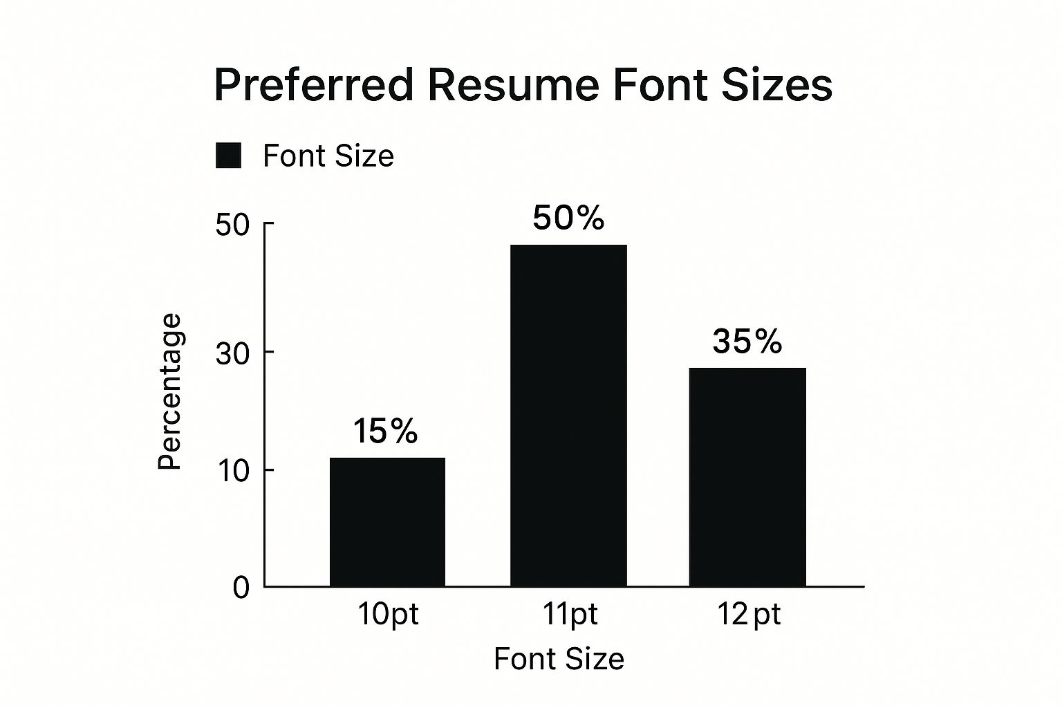
As you can tell, an 11pt font is the clear winner. It hits that perfect balance between being easy on the eyes and making efficient use of your page space.
To give you a clearer picture, here is a quick reference table for setting up your resume's typography.
Recommended Resume Font Sizes | |
|---|---|
Resume Element | Recommended Font Size (Points) |
Your Name | 18-24pt |
Section Headings | 12-16pt |
Body Text & Bullet Points | 10-12pt |
Contact Information | 10-12pt |
This simple structure creates a professional, scannable document that looks great to both human recruiters and the Applicant Tracking Systems (ATS) that often scan it first.
The most important thing to remember is consistency. Once you've picked your sizes for headings and body text, stick with them. A uniform approach results in a polished, organised document that makes you look like the professional you are.
Choosing Fonts That Respect Local Standards
When you're building a resume for the Latvian job market, your font choice is about so much more than just looking good. It's a fundamental sign of your professionalism and, crucially, your respect for the Latvian language itself with all its unique diacritical marks.
You absolutely must pick a font that can flawlessly display special characters like 'ā', 'č', 'š', and 'ņ'. Just picture a recruiter opening your CV and seeing your name, "Jānis Bērziņš," mangled into something like "J?nis B?rzi?š." That tiny technical glitch instantly sends the wrong message, suggesting a lack of care and making your entire application feel sloppy.
Getting this right isn't just about avoiding a technical error. It’s a powerful, non-verbal cue that you understand and respect the local culture. It shows you've put in the effort to present yourself properly, ensuring every detail is clear, accurate, and professional.
Fonts That Get It Right
So, how do you steer clear of this problem? Simple. Stick with the tried-and-true professional fonts that are universally known for their fantastic character support. Latvian recruitment experts consistently recommend these for their unmatched clarity and reliability.
Arial: You can't go wrong with Arial. It's a clean, standard sans-serif that’s incredibly easy to read and fully supports every Latvian diacritic.
Calibri: A bit more modern and friendly, Calibri is another top-notch sans-serif choice that handles special characters beautifully, keeping your resume looking sharp.
Times New Roman: For a more traditional or formal feel, this classic serif font is an excellent option that also provides rock-solid support for Latvian characters.
Selecting a font that properly supports local diacritics is a small but powerful way to demonstrate your thoroughness and respect for the employer's culture. It’s a detail that ensures nothing gets lost in translation.
While international guidelines for resume font size are a great starting point, choosing a compatible font type is even more critical here in Latvia. Fonts like Arial and Calibri are so popular for a reason—they perfectly render every special character in the Latvian language, a must-have for local employers. You can dive deeper into Latvian CV best practices to see exactly why these fonts are the gold standard.
How to Beat the Resume-Reading Robots
Before your resume ever lands in front of a human, it has to pass a critical first test. It gets scanned by an Applicant Tracking System (ATS), the software that acts as a digital gatekeeper for over 98% of Fortune 500 companies and countless others.
Think of the ATS as a very literal-minded robot. It doesn't appreciate fancy designs or creative flair; it just wants to extract your information quickly and cleanly. If your resume font is too small, too decorative, or just plain weird, the ATS robot can get confused. When that happens, it often just tosses your file aside, and your amazing experience becomes completely invisible.
This is precisely why your font choices are so incredibly important. The right font and size make sure the robot can read every single word, giving your application the green light to finally reach a real person.
Your ATS-Friendly Formatting Checklist
To make sure your resume sails right through this digital screening, you need a clean, standard, and robot-friendly format. The goal here is pure simplicity and readability. Forget those flashy columns, tables, or graphics you might be tempted to use—the ATS often can’t decipher them correctly. A straightforward, single-column layout is always your safest bet.
Here’s a simple checklist to get your resume optimised for these systems:
Stick to Standard Fonts: Use universally recognised, easy-to-read fonts like Arial, Calibri, or Times New Roman. These are the languages the ATS speaks fluently.
Create a Clear Hierarchy: Use bolding and slightly larger font sizes for your name and section headings, but don't go crazy. This simple structure helps the ATS understand how your document is organised.
No Funny Business: Avoid icons, images, tables, or multi-column layouts. While they might look great to the human eye, they often turn into unreadable gibberish for an ATS.
File Type is Key: Always submit your resume as a .docx or PDF file unless the job posting explicitly asks for something else. These formats do the best job of preserving your layout.
Think of your resume as a key. A simple, standard key will open the lock (the ATS) every single time. An overly ornate or strangely shaped key will just get stuck, no matter how beautifully it's designed.
By following these guidelines, you’re not just creating a document; you're building a passport designed to get you past that first, crucial checkpoint. Recruiters themselves use sophisticated software to find candidates, and you can get a peek into their world by exploring the [top free resume search tools recruiters use](https://www.yena.ai/post/top-12-free-resume-search-tools-for-recruiters-in-2025). Seeing things from their side really drives home how vital it is to be machine-readable right from the start.
Finding that Perfect Balance Between Your Content and White Space
Let's be honest, trying to cram years of fantastic experience onto a single page can feel like solving a Sudoku puzzle on hard mode. While picking the right font size for your resume is a massive part of the equation, it's not the whole story. The real secret to a resume that gets read, not just glanced at, is the masterful use of white space.
Think of white space as the quiet pauses in a great song. It gives the reader a moment to breathe and focuses their attention on what truly matters: your incredible achievements. A resume packed to the gills with text is visually exhausting and can scream "I'm overwhelmed!" In contrast, one with plenty of room to breathe projects confidence and clarity.
It’s all about creating that visual harmony. When you use margins and clean formatting to your advantage, you're not just listing facts; you're telling a compelling story and guiding the recruiter's eye right where you want it to go. Suddenly, your resume becomes a pleasure to read, not a chore.
Simple Tricks for a Cleaner, More Inviting Layout
Creating this "breathing room" doesn't mean you have to slash your proudest moments. It’s all about presenting them in a smarter, more scannable way. Your goal is to make it ridiculously easy for a busy hiring manager to see your value in seconds.
Ready to give your resume a facelift? Here are a few dead-simple ways to do it:
Mind Your Margins: Stick to margins between 1.27 cm (0.5 inches) and 2.54 cm (1 inch). This is the quickest way to open up the page and make it feel less cramped.
Embrace Bullet Points: Ditch those long, winding paragraphs under each job. Instead, use sharp, punchy bullet points to highlight your wins and responsibilities. They’re infinitely easier to scan.
Build a Visual Hierarchy: Use bold text and slightly larger fonts for your section headers (like "Experience" or "Skills"). This breaks your resume into neat, logical sections that are easy to navigate.
When you get it right, white space transforms a dense document into an approachable, professional snapshot of your career. It subtly shows that you value clarity and know how to present information effectively—a skill every employer wants.
This push for readability isn't just a trend; it's becoming a standard. Take, for example, how Latvian public information portals are now focusing on adjustable font sizes to improve digital access for everyone. You can see how Latvia is championing digital inclusivity, which just goes to show how critical onscreen readability has become.
For more insider tips on catching a recruiter's eye, check out our guide on the [top recruiting best practices](https://www.yena.ai/post/top-recruiting-best-practices-to-attract-talent-in-2025).
Common Questions About Resume Font Size
Even with all the guidelines, I know that picking the perfect font size for your resume can feel like walking a tightrope. You want to nail it to make the best impression possible. Let’s tackle some of the most frequent questions I hear, so you can put the final touches on your resume with absolute confidence!
Getting these last few details right will make sure your resume is polished, professional, and primed to get you that interview.
Can I Use a Font Size Smaller Than 10pt?
I get it, the temptation is real, especially when you’re desperately trying to fit your brilliant career onto a single page. But please, resist the urge! Anything smaller than a 10pt font is genuinely difficult for recruiters to read. Think about it – they’re scanning dozens, sometimes hundreds, of resumes a day. Don’t make them squint!
More importantly, many Applicant Tracking Systems (ATS) can’t properly parse tiny text, which could get your application tossed out before a person ever lays eyes on it.
Before you shrink your font into oblivion, try these tricks first:
Be Ruthless with Your Words: Can you say the same thing with fewer words? Make every bullet point punchy and powerful.
Play with the Margins: You have a little wiggle room here. You can safely shrink your margins, but never go below 1.27 cm (0.5 inches).
Cut Irrelevant Info: Be honest. Does that summer job from ten years ago really apply to this senior role? If not, cut it.
Should My Cover Letter Font Size Match My Resume?
Yes! A thousand times, yes! This is one of those small details that makes a huge impact. Using the same font style and size for both your resume and cover letter creates a cohesive, professional-looking application package.
Think of it as creating your own personal brand. It shows you’re organised, detail-oriented, and take your professional image seriously. They’re a matching set, and they just look so much better together!
Remember, your application documents are a direct reflection of your professional standards. Keeping your font and sizing consistent shows that you are thoughtful and meticulous in your work.
What Is the Best Font Size for a PDF Resume?
The rules don’t change just because you’re saving as a PDF. You should absolutely stick to the gold standard: 10-12pt for the main body text.
A PDF is fantastic for locking your formatting in place, ensuring it looks exactly as you designed it. But you have no control over how a hiring manager will view it. They could be on a small laptop, a massive desktop monitor, or they might even print it. A standard, readable font size ensures your resume looks great and is easy to read, no matter the device.
When in doubt, getting a fresh pair of eyes on your resume is a game-changer. You can learn more about the benefits of a professional [resume review service in our complete guide](https://www.yena.ai/post/resume-review-service-your-complete-guide-to-smarter-hiring).

Comments